If you want to add more colour into your home but fear total disaster, then you need to know about the classic design rule that helps you create a balanced colour palette: the 60-30-10 rule.
The 60-30-10 rule is an easy-to-follow approach that many designers use to ensure they’re layering colours in a way that works.
What is the 60-30-10 rule?
The 60-30-10 design rule is a simple guideline to help you create a balanced and beautiful colour scheme in your space. In other words, it helps you understand how much of a colour to use.
Based off the rule of thirds (which is also big in other areas like photography and floral arrangements), the principle uses three different colour families to help create depth, atmosphere and cohesion.
According to the rule, 60% of your space is usually dominated by walls and larger pieces; 30% is often accent furniture, curtains, rugs and other textiles; and the remaining 10% are typically decorative pieces – think art, lamps, cushions and other decor.
You then apply a colour scheme to these areas following the same 60-30-10 allocation.
How to use the rule in your home
The main colour that you want to build your palette from should be used in 60% of your room. It’s the colour that will help to anchor the space and will form the backdrop for the remaining hues. This will usually include what paint colour or wallpaper you plan to use for your walls.
The secondary colour adds contrast and should be threaded through 30% of your space. You’ll be using this half as much as your dominant colour, so try to choose a shade that complements it. Play around with different materials, textures and shades in the same colour family to help create interest in the room. Don’t forget, you can also add a feature wall in this colour scheme.
The last 10% of colour will be your accent that adds dimension and pulls everything together. Have a bit of fun with this. A few bold choices can make a statement or help show off your personality. That being said, you can totally keep things more restrained, depending on the overall look you’re going for. Like your secondary colour, experimenting with different materials, shades, patterns and textures is a great way to add in your accent tone.
Remember, the 60-30-10 rule is a guide. Once you’re feeling more confident you can start to riff.
The 60-30-10 rule in action
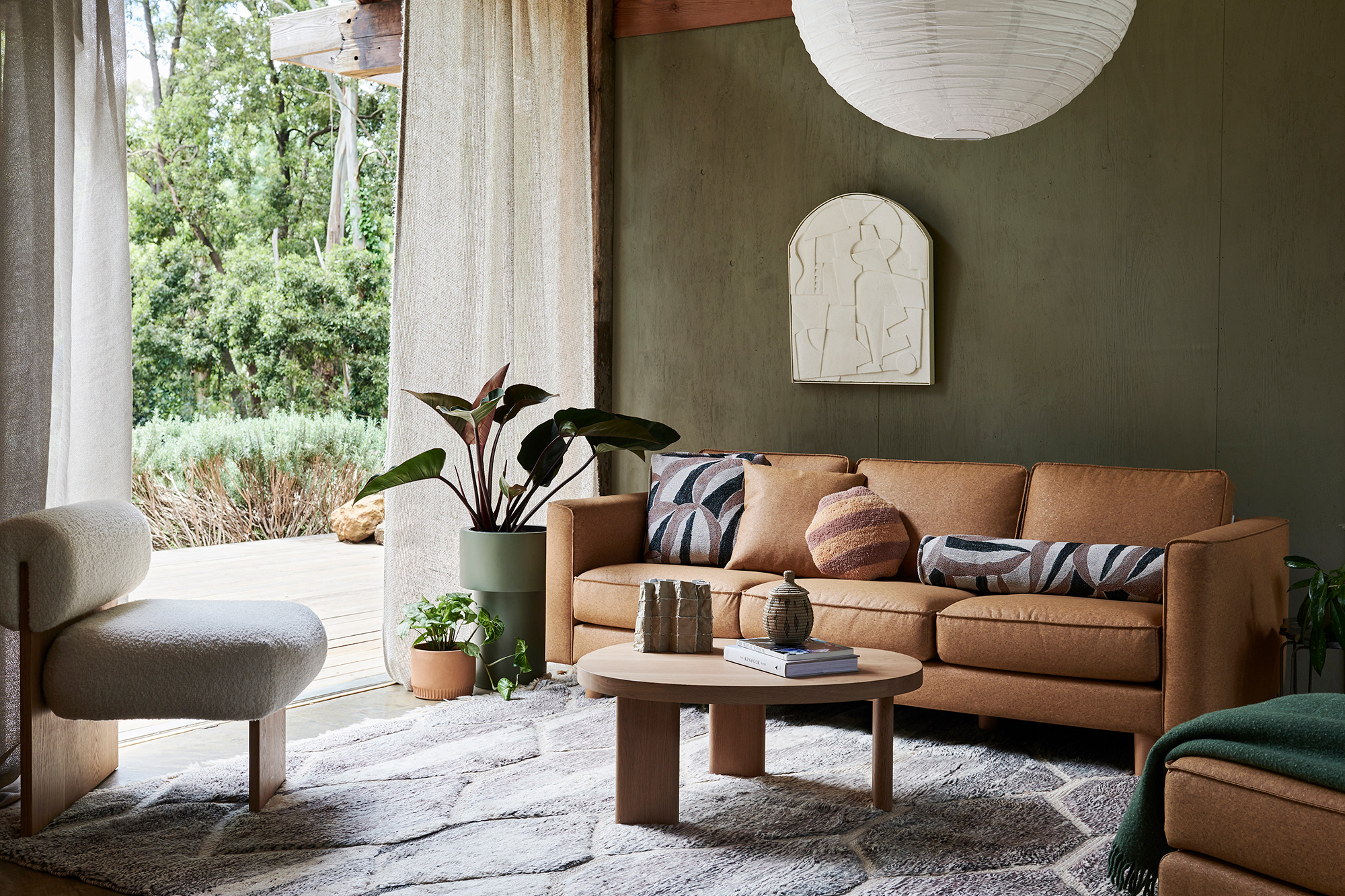
Earthy greens
It’s one thing to read about a design rule, but how does the ethos play out visually? Here are some examples to show you the 60-30-10 rule in action.
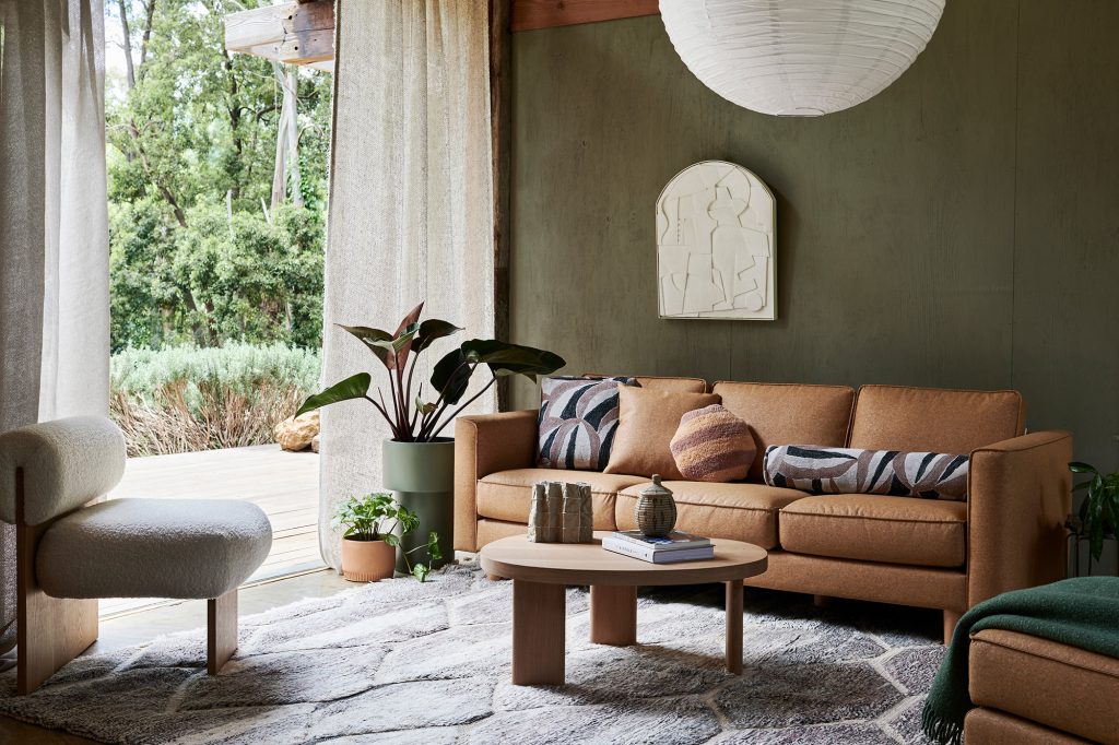
The gorgeous earthy green on the walls (as well as plants and some decor) is the dominant colour in this living space. The secondary colour family are neutrals in a variety of textures and materials – biscuit tones in the curtains and side table, the grey-toned area rug, cream artwork, the light-coloured wooden coffee table and white lampshade.
The accent colour here is the terracotta family.
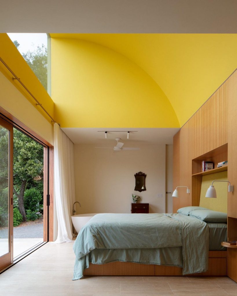
It’s all in the neutrals
This bright and contemporary bedroom is an exercise in why using neutrals as an anchor point opens you up to having all sorts of fun with your colour scheme.
Neutral tones are the dominant colours within the ensuite, on entry walls, across the flooring, curtains, wall sconces and bathtub. A third of the room features a vibrant canary yellow by painting a section of the arched ceiling and bedhead area. The accent colour in 10% of the space is the green bedding.
Hot tip: If neutrals are your safe space, bedding is a low-risk way to dip your toe into the world of bolder colours. You can start subtly with sheets or use a colourful duvet cover to set a new mood. We wrote about colour psychology, too, if you want to know what different colours say about you.
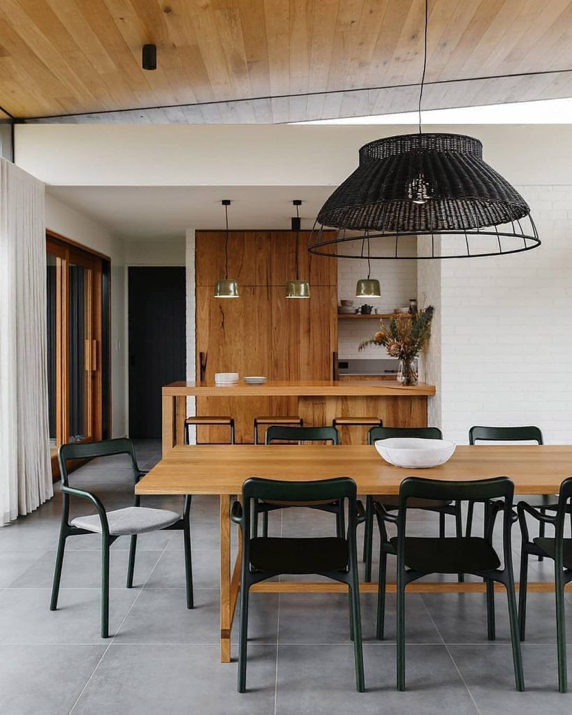
Whites and greys
You may think there isn’t really ‘colour’ in this kitchen, but this sleek space shows how materials and texture can also do the talking with the 60-30-10 rule.
The dominant tones are neutrals in white and grey, covering 60% of the area from floors and walls to curtains. The next 30% of colour takes shape through timber, the lovely brown tones grounding the space. Timber also balances out the 10% bold black accent colour, found in the hanging feature light and dining chairs.
If in doubt, the 60-30-10 rule is a tried and true method for home decorating. One that can help you transform your space and take the leap into the wonderful world of colour.
Try it yourself
Feeling confident? Have a look at our new Koala homewares range, and see how you can put the 60-30-10 rule into action yourself!